
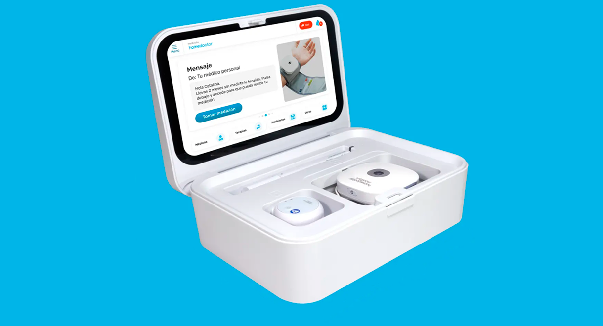


Homedoctor Carebot it’s a medical device that can display up to 210 different measures to help you and your family be in control of your well-being.
I was briefed to design and control the UX and UI process, taking into account heuristic principles, focusing on those related with error prevention
The final result was that 65% of existing clients updated it’s suscription and we increased new clients by 17%.
At the initial stages of the process we wanted to create as much user flows as possible to figure out bottlenecks, improving navigation and reducing user friction while using the Medbot.
Highlighted here we have some examples of the navigation through the different Medbot screens, having all these mid quality screens defined helped us to make sure we were aligned to the information architecture on how the device should work.
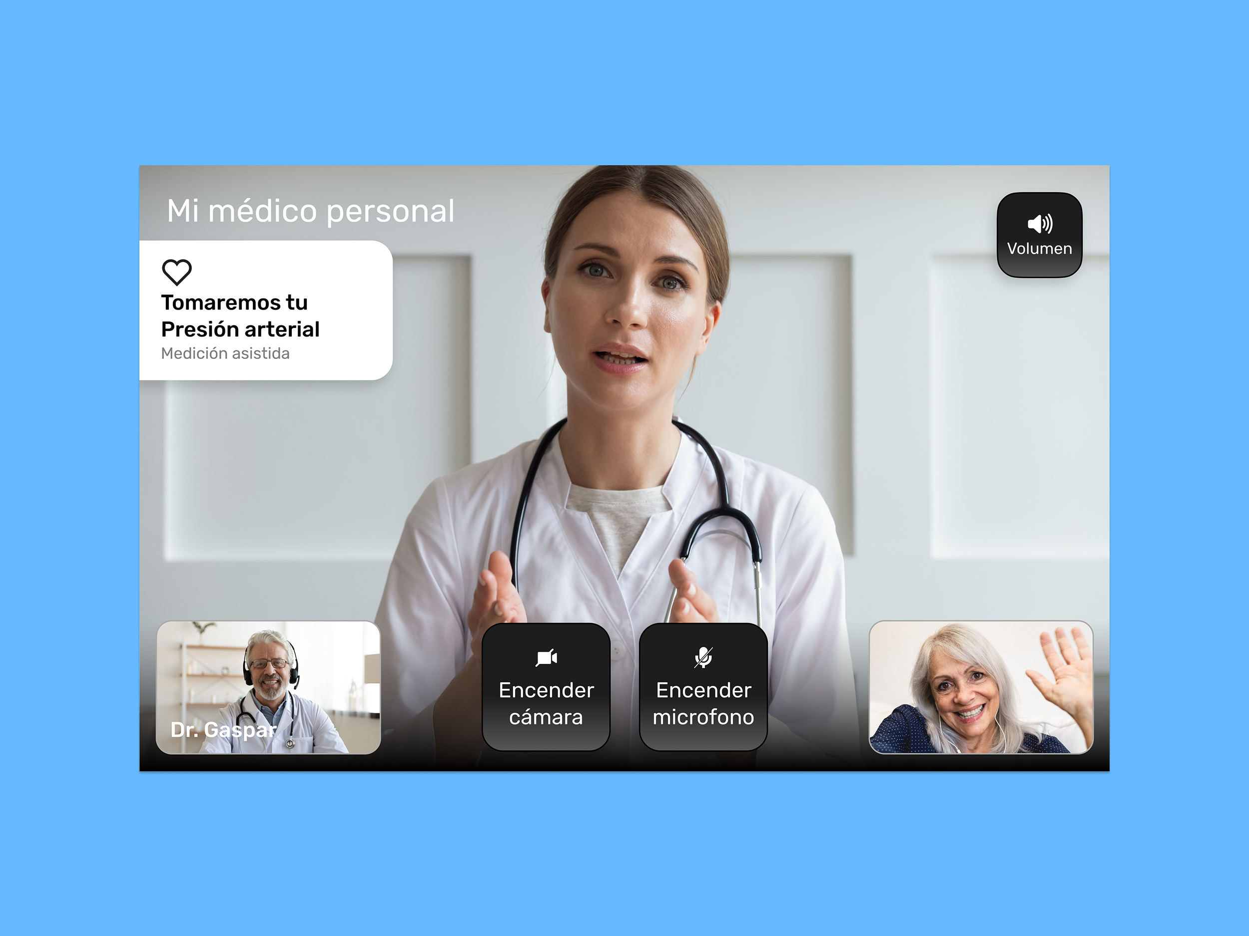
Finally here we have some screens on how the screens should be displayed, ensuring each screen followed the design system guidelines from Homedoctor
We made sure communication between departments were constant to make sure no final set ups happened. This app took us around 8 months and involved a team of 6 members.